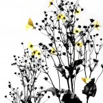
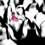
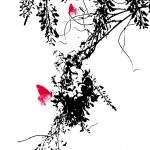
Sumi-e, or Ink painting, was developed in China during the Tang Dynasty (618-907). It was brought to Japan in the 14th century, probably by Korean zen monks. Sumi-e uses tonality and shading achieved by varying the ink density. The goal is not to capture the likeness of the subject, but rather its essence. Early sumi-e pictures were painted with black ink only. Later forms included one additional colour, often red, as a highlight and counterbalance.
Silhouettes from black card became popular in Western Europe in the mid-18th century. The term “silhouette” was mainly used from the early 19th century. Before this time, the term was “shades”. Cutting or painting silhouettes was a cheap but effective alternative to the expensive portrait miniature. Skilled profilists would record the face itself as a black silhouette and do delicate shadings of black to show details of the hair and clothes of the sitter. Though the technique of cutting silhouettes is still alive today, silhouettes became less popular with the rise of photography. Today’s silhouette art is often done by computer.
Exhibition “Spring Butterflies – A Photography Project”
You can click on the photos to enlarge them.
I am very proud that three of these photos have been selected for the design of “A River of Pearls – Barroco“, the latest poetry book of Chiyo Kitahara.
Some of these pictures are also presented by Chiyo Kitahara in her periodical “Rose-coloured Claw” (“Bara-iro tsume”). You can visit the exhibition on Ms Kitahara’s poetry here.
About “Spring Butterflies – A Photography Project”
How did you come up with the idea of working mainly in black and white?
When I saw the Florentine hills in Italy in the evening sun in all the glory of stone pines, cypresses and villas black against the sky, inspiration struck: I wanted to work in the silhouette style.
But you did not do it in the traditional way …
Cutting cardboards with complicated architectural designs or delicate portraits did not feel right for me – I am the person who gets hurt by just looking at scissors. However, I have always enjoyed gardens and taking photos of flowers. I decided to use the camera as a tool and plants as a motive.
What was the creative process?
The first step was to manipulate the photos of the flowers with photo software to get a black-and-white effect. Now, I had a silhouette, including the delicate shadings. But it wasn’t yet what I wanted. The black-and-white flowers looked rather melancholic. There wasn’t anything light-hearted about it, nothing easy-going like the Italian evening in the Florentine hills.
Then I remembered Japanese sumi-e. I had seen ink paintings of plum trees just starting to bloom, a few blossoms done in colour while everything else was black and white. Adding one spot of a bright colour marked the shift from winter to spring. It also meant hope.
So, silhouette style or not – you wanted colour?
Exactly – to underline the idea of serenity. I didn’t stop at colouring a blossom, though, but chose the symbol of a happy-go-lucky existence par excellence: the butterfly. It is tricky to get a good shot of these flighty creatures, but after many photos of butterflies in the wrong angle, nearly out of the picture or gone already, I finally succeeded. Then I manipulated their colour and added them to the picture.
Go to the main page of the Museum of Creativity.
Go to the blog.


